Momentum Solar
Power to the People
What did I do:
Research and completely revamp the user onboarding site for one of the nation’s largest residential solar contracting companies.
Team:
Edmond Huot - Product Owner
View the live site here. I have gained full permission to publicize the process and data from Forward Media and Momentum Solar.
situation Analysis
After 3 years of steady and impressive growth, Momentum Solar is poised to become one of the nation’s #1 residential choices for solar. Momentum Solar hired Forward Media Design Agency to completely redesign the entire website.
The existing website has a largely disorganized pool of information and disclaimers which makes it hard for the potential customers to see the value of installing residential solar panels and the benefit of working with Momentum Solar is. As a result, over 90% of their lead generation came from cold calling using their large-scale call center rather than making the website work for them as a method of lead generation. Costumer who used the website to contact Momentum Solar were largely skeptical and unfriendly towards the sales reps.
The Challenge
Our main goals for redesigns are:
Users often leave Web pages in 10–20 seconds, but pages with a clear value proposition can hold people's attention for much longer. The front page needs to demonstrate not only the value of going Solar but going Solar with Momentum quickly and effectively.
Increase the effectiveness of the website as a lead generation tool.
Educated the customers about the benefit of installing Solar Panels, the price of installation, what the process is, and why they should choose Momentum Solar over other leading brands before they contact the reps, saving the rep time and increasing their sales efficiency.
My Role
As the sole designer on the project, I had an enormous amount of freedom and autonomy to build the project from start to finish. Ed was there to help me build the brand’s identity and marketing language as I worked to renew the website’s architecture, user interface, and a complete style guide to hand off to the dev team.
Picking up the pieces
Our first step was to evaluate the current site architecture and quickly identify the current site’s area of deficiency using my knowledge of UX laws and principles with Ed as an aid for a second opinion on my assessment.
Using 7 Gestalt’s Principles of Perception and a few other UX principles listed above, I was able to quickly identify why the current site is ineffective in grouping relevant information together. The navigation is messy and the topics of each page don’t always correlate to the page title and tab name.
The information is all over the place and it’s difficult to search for any area of interest around solar panel installation. It does not cater to any demographic. And even if the user is interested in learning more about Solar, it’s difficult to get any straightforward answer from the website itself.
There are many tabs on the header that does not relate to signing up for Solar installation.
Market Research
So I know why the current site doesn’t work. The site also didn’t give me enough information on the residential solar business as a whole and I spent some time researching the solar business as a whole so we know what questions we should ask the users and stakeholders. Through the initial conversation with Momentum Solar, we were able to access their Google Analytics.
Google Analytics Insights
They like to shop
Shopping style - luxury offline: 55% higher
Frequent remodeler: 42% higher
They’re online savvy
Prefer to browse online: 56% higher
Prefer to purchase online: 42% higher
They’re high impulse
Household income: 41% higher
Credit rating: 7% lower
They do their research
Shopping style - bargain hunter: 39% higher
More likely to purchase books: 23% higher
Those data-points helped us with creating some assumptions and organize a user story map for the onboarding process.
Usability Testing
To confirm the assumptions we had, we asked 5 homeowners for contextual inquiry (observe their behavior while performing tasks we instructed them to complete). We asked them questions when they appear visibly confused, or when they are stuck.
We also directly interviewed them afterwards to get feedback on what some of the things they are looking for during their search and what part of their search was confusing. Here are some of the things they were concerned about or frustrated with.
State Cash Rebate Incentives?
The site prominently features state tax-rebate and installation incentives for selected states. When the tester clicked to learn more they were directed to an external site with little information. They also thought it would probably be a hassle to apply for the rebates and it’s not a real cost-saving benefit if they had to work for it.
Annoying Free Quote Process
Upon instructing the user to sign up after reading up some information available on the site, they avoided the “contact us” section and scrolled back to the top to press the “Free Quote” button on the hero section of the page. They voiced displease about how long the sign up process is and asked why some of those questions are relevant.
Unclear Pricing Model
The site promised savings but custom engineering, quality materials, and free maintenance. it seems unimaginable. Many costumer’s initial assumptions were that the panels are probably so expensive the monthly cost savings wouldn’t make sense anymore.
Unable to find info
They cannot find info on the installation process. The site promised a free quote and just some vague marketing language after visiting the “what to expect after installation” page. They have no idea what to expect if they signed up.
We interviewed Momentum Solar’s core stakeholders via Zoom based on the feedback. We prepared a list of questions about Momentum Solar’s onboarding process and pricing and purchasing models, incentive by State, servicing areas, areas they might expand to, how much work they would cover in the installation process, and if there are any laws and regulations around solar installation we need to be aware of.
User Personas
From the Analytics result and interview data, we created 3 main user types.
The user personas are made from my usability testing and analytical data. They helped with personifying the main pain-points and issues I found on the site. By giving the customers a voice it helped with gaining stakeholder buy-in on the solutions I present to them.
Adaptive Sitemap
The site holds a lot of information. But we organized it by area of interest. It’s there to answer questions from potential on-boarders, so I made it as contextual as possible, but with many opportunities to dive in deeper into the site architecture to learn more details about each topic.
Easy Navigation & Information Hierachy
We reduced the header navigation from 12 pages of unorganized info dump to 5 main areas of information answering some of the most pressing questions Momentum’s customers might have (client request to add a 6th link for returning customer payment processing). Each section contains relevant images and prominent titles so the user knows what they would learn from the section before reading any details. For those who need more than the superficial information, each hot topic includes secondary links for any potential on-boarders to learn more, while they are constantly reminded that they can EASILY sign up to learn more through a simple 5 field entry process.
After the initial wireframe process, Ed helped me with UX writing conveying the messages through the user’s point-of-view posing the areas of interest as questions the customers would ask.
Contacting Representatives, made easy
Regardless of the context of the customer’s inquiry, the ultimate business goal for Momentum Solar’s goal is to gain additional interest and drive the ROI they hired us to build the site! That’s why we placed a Contact button on top of every main page’s hero section, the navigation bar, linking to contact-form on the bottom of every page. We also simplified Momentum’s extraneous contact to prevent any potential customer from abandoning the process.
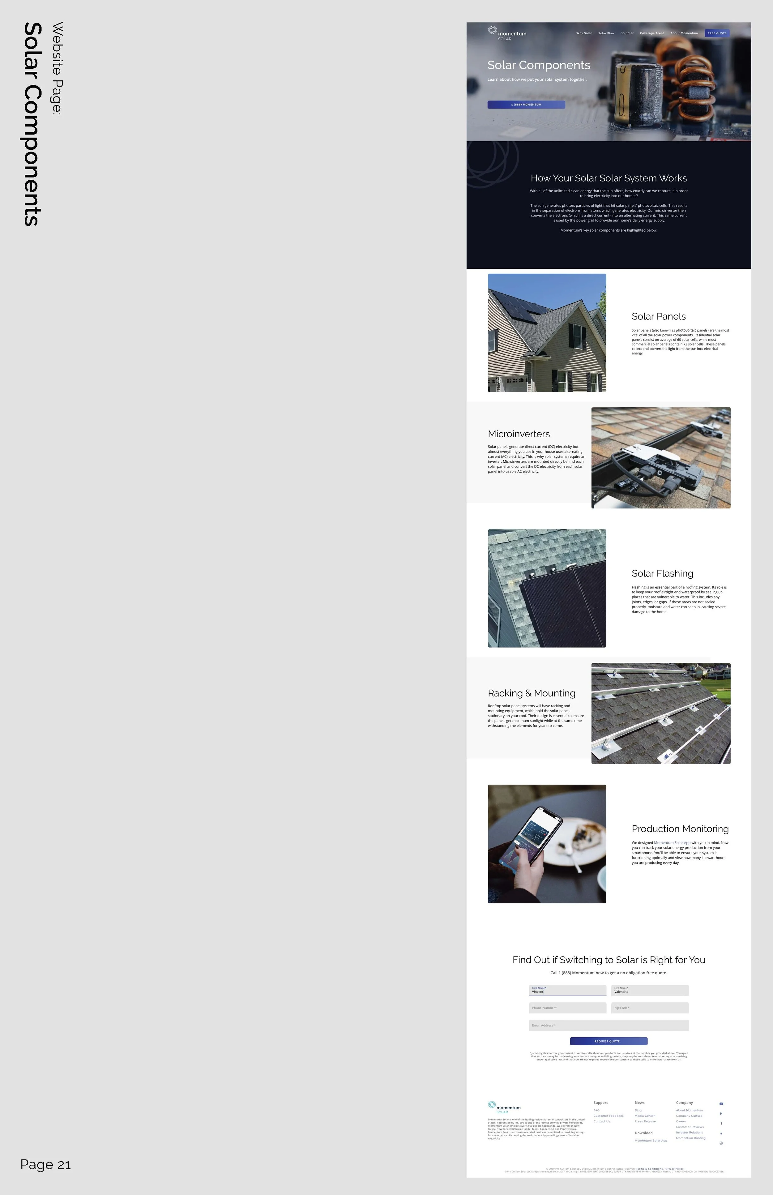
Some of the Supporting Page Designs
Positive Press Generates Additional Leads
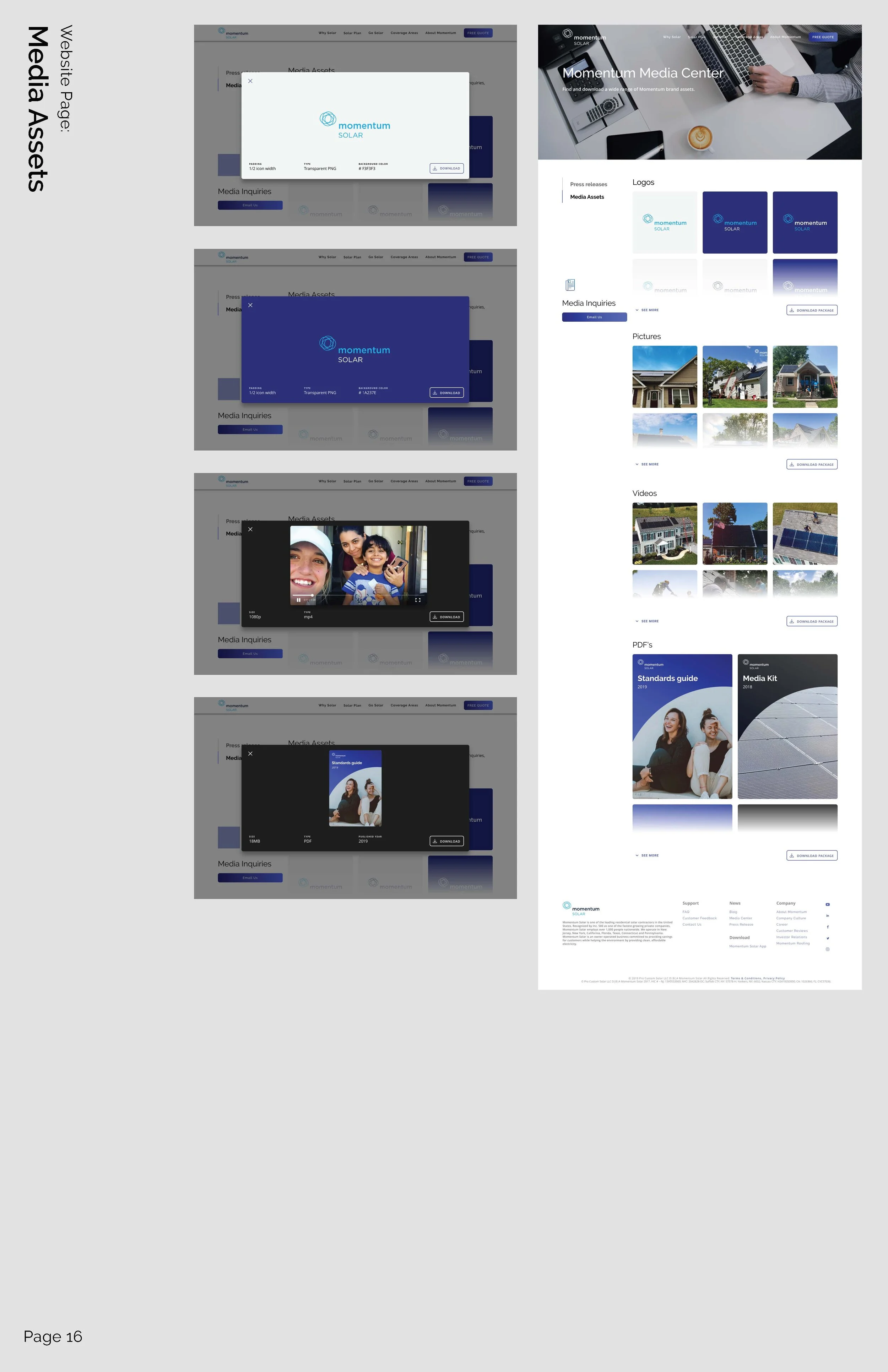
Momentum’s third most popular medium is from positive press! In order to provide better assets such as logo and branding guidelines to news outlet and blog writers. We comined this page as “Media Assets” as this is the intent for the page. The page also has a sub side menu linked to Press releases. Those serves as past positive news as another medium to install trust on potential customers, they also serve as examples for other future writers to peruse from.
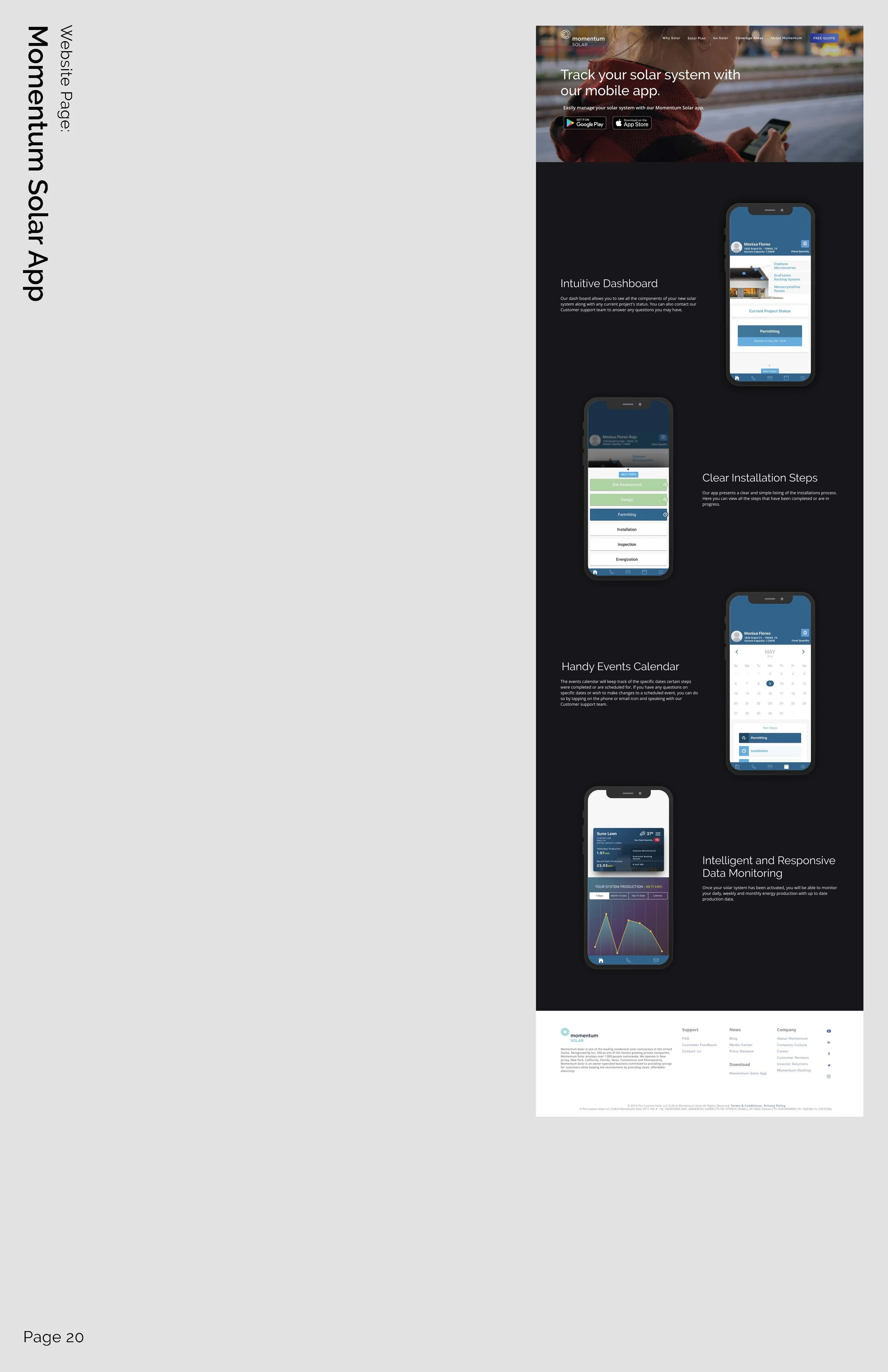
Free Monitoring Application Adds Additional Value
The App Download Page is sent to the costumer right after Momentum Solar gets permission to operate from the local utility and municipal to activate the system. Momentum Solar will contact the customer to congratulate their successful activation and then provide the tracking application so they can start monitoring their savings and electricity generation!
Collecting Quantitate Data Directly from Customers
More Than just the Coverage Area
The Feedback Page is given to every costumer at the END of their installation process. It’s there to collect data on any costumer journey pain-point Momentum Solar could actively work on improving. This step is crucial for Momentum Solar to keep evolving the user journey map we provided them!
It also helps with generating a more positive off-site customer experience and promote future recommendation from costumer to their family and friends - other potential costumers!
The Coverage Area Map is connected to the main navigation so anyone can find out where the service areas are right away. States Momentum doesn’t serve yet can click on the map to report interest in the product. The states momentum does serve are linked to a detailed page about the specific state’s solar policies, incentives, rebates and tax credit benefits if any. It’s more specifically catered to each target market so they can learn information that’s relevant to them.
Page Design Overview
After 4 months of collaboration, the final presentation to Momentum Solar takes on a more traditional approach.
Ed and I printed out all the pages on massive poster papers and stitched them together. We made an appointment with the core stakeholders of Momentum Solar and drove down to their main office for an official sign-off on the presentation. We got an overwhelming amount of positive feedback from all core stakeholders. They loved everything about the new design!
(Click on the image below to see specific pages)
Dev Hand Off
Since Momentum Solar costumers are tech savvy users who access the site via various mediums, we created 3 breakpoints for every page - Mobile view, Tablet view, and Desktop view to ensure seamless viewing experience on every device.
Iconagraphy
The icons in the design are all custom crafted, each of them has a 2px wide stroke. The gradient uses the primary color from the design. Each icon is exported into SVG and PNG file for the dev team. The original Illustrator file and icon grid is provided to Momentum Solar in case their in house graphic designer want to create any additional icon in the future!
COMPREHENSIVE Style Guide
Because Forward Media hires white-glove developing team to complete the projects they were not part of our UX process. In order for deliver complete and clear instructions with consistent standard and duplicatable assets.
The Impact
Since launch, Momentum Solar saw a 42% increase in contact rate from their digital advertisement campaigns of the same format.
Their reps were able to save more time on explaining the basic concepts and benefits of solar, and the difference between each plan, and focus on vetting the candidates, helping them decide on material usage optimal design instead. Momentum Solar was able to keep up with the increased demand without any increase in contact specialist workforce.
Thank you for reading!


